Holly Street
Physical Therapy
Branding
In the heart of Siloam Springs...
Holly Street Physical Therapy is a local practice that has served the community for 30 years. They’ve built a reputation for their friendly, welcoming environment and their commitment to personalized care, catering to each patient’s individual needs.
To begin this project, I researched their current brand, other physical therapy brands, and the core essence of physical therapy as a whole.
I created this logo to reflect stability, balance, and the idea that physical therapy builds a foundation for each individual.
The logo I created features a stability ball, a Bosu ball, and a building block found in childhood wood block sets. I rounded all corners to give it a more friendly feel and connected each element to reinforce the personal connection that Holly Street prioritizes.


Intentional Process

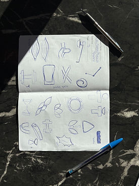


On my final page of thumbnails, I had the idea that would turn into the final logo
I began this rebrand project with researching the current brand, exploring their website and socials to find out more about them. Besides their current badge logo, there was not much brand identity for Holly Street Physical Therapy. I heavily researched physical therapy imagery and how I could create a mark that would stand out in the market.
Fun Fact About Me: Physical therapy was actually my second choice of career. I would love to explore more imagery in this field.